
High Point University

Architecture
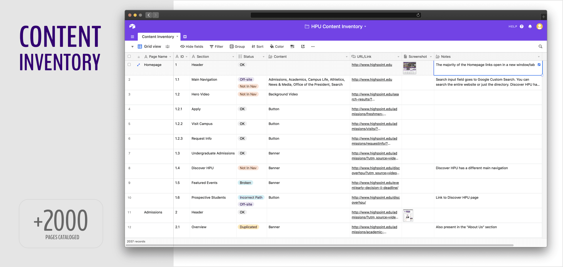
The current website had more than 2.000 pages with scattered, duplicated, and outdated content which drove me to focus on the following premises for the new website's architecture:
- Inventory the entire website to remove, change, and add new improved content
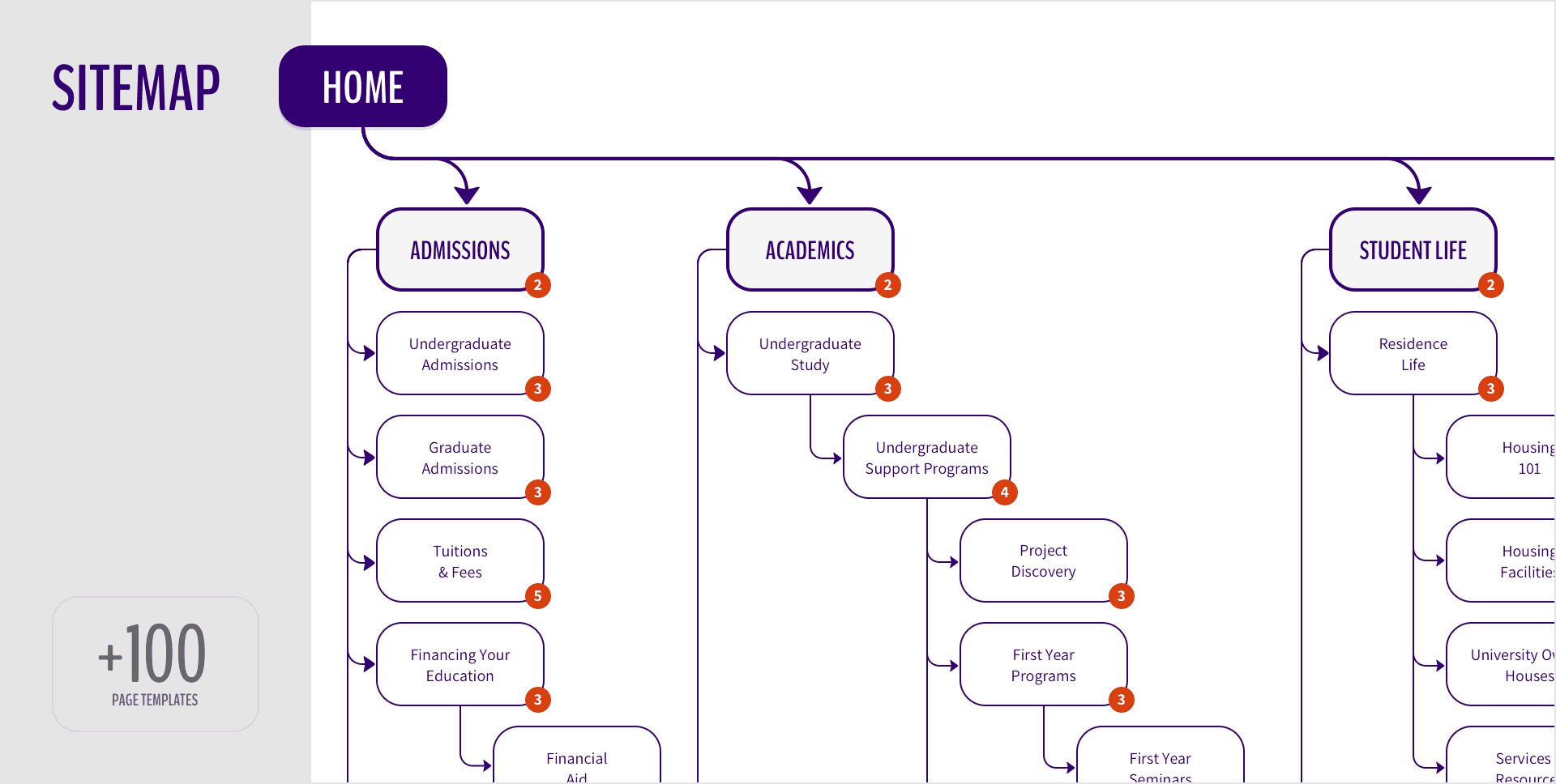
- Create brand-new navigation with relevant pathways to the users
- Create a page hierarchy following the audience's actual needs
- Reduce the number of pages to speed-up access to the content
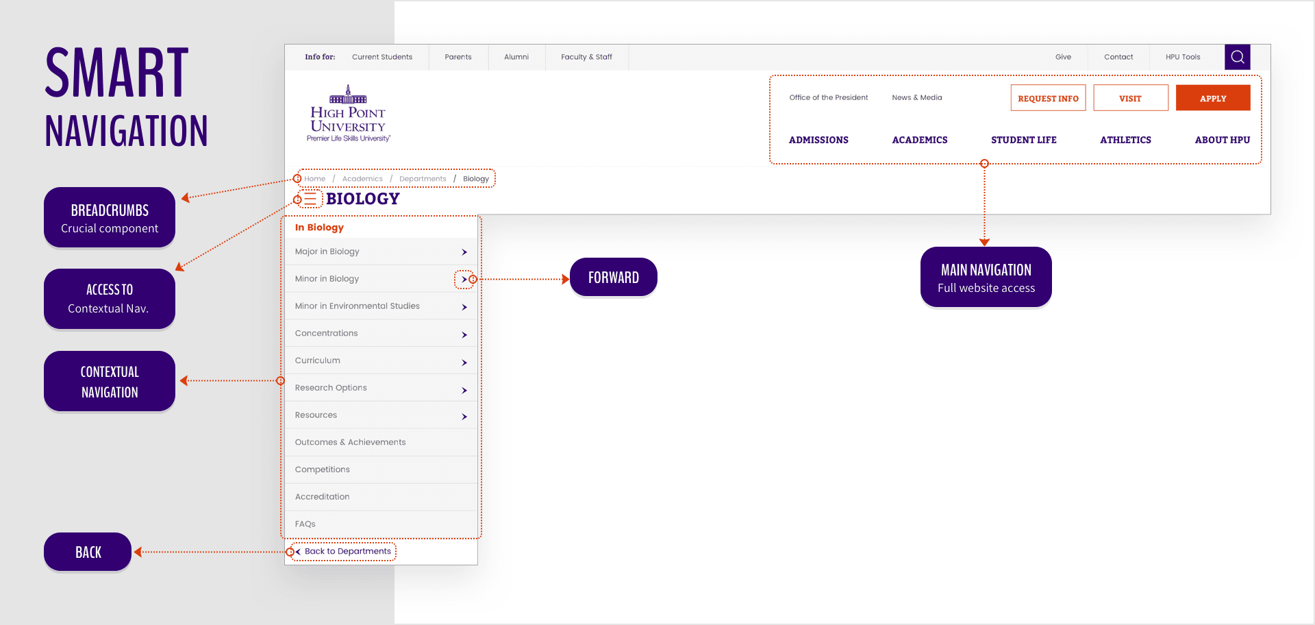
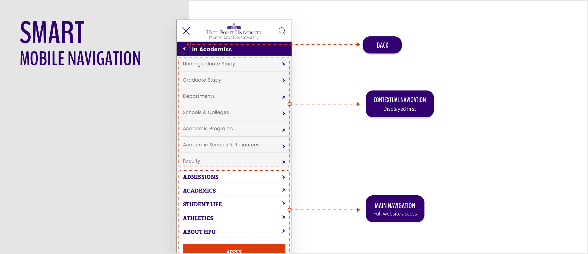
Smart Navigation
Most university's websites have a poor navigation because once you arrive at a department level or a deeper page, it redirects users to a subdomain (or even a different website) with a distinct navigation which generates confusion and users might get lost having to type the university URL again and start the entire process from the beginning.
I've decided to abolish that approach by adding smart navigation which users can have quick access to the contextual menu without losing access to the global navigation either on a desktop computer or on a mobile device.
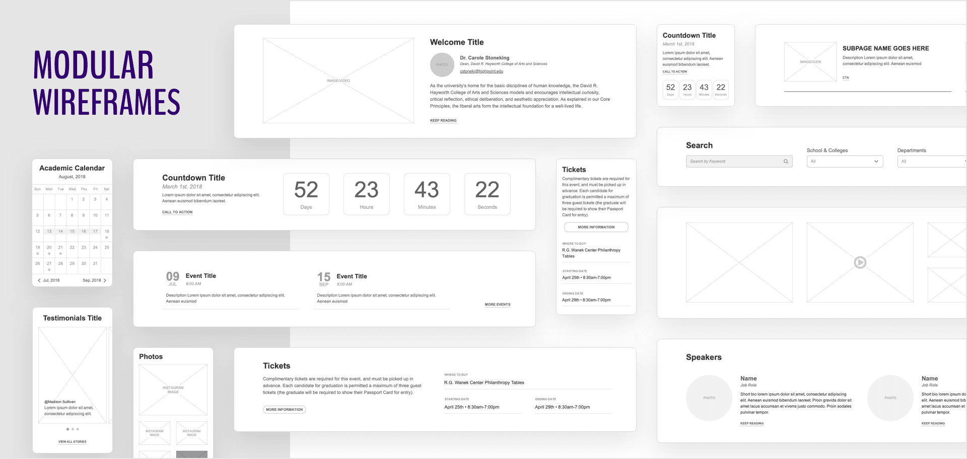
Wireframes & Modular Approach
In regards with a website of this magnitude: +100 page/templates, +15 distinct departments feeding the website every day, you cannot think page-wise which would increase considerably the design and maintenance process, that's why I've decided to go modular.
With a modular approach it's possible to achieve:
- Infinity page template possibilities/combinations
- Group key entities by making those recognizable visually which improves scannability
- Remove unnecessary content by condensing information into digestible pieces of information
- Reduce staff learning curve and maintenance costs
Prototypes
By analyzing and studying the audience, we've realized that would be crucial to have a dynamic look and feel for some key pages in order to attract the desired audience without losing the modular approach and the responsive aspect I have already implemented.
The key to achieving success by adding animations and dynamic interactions to a page is to make it visually appealing without losing sense of the purpose of the content and by making it consistent with the main conversation you are having with the user. Without these factors, it's just a bunch of elements moving around. You can see what I mean on the prototypes below:


Documentation
A complex project like this must be followed by very detailed and well-explained documentation to handle the website for the years to come. I was able to narrow it down to two main documents: a functional specification and a page/module mapping guide.
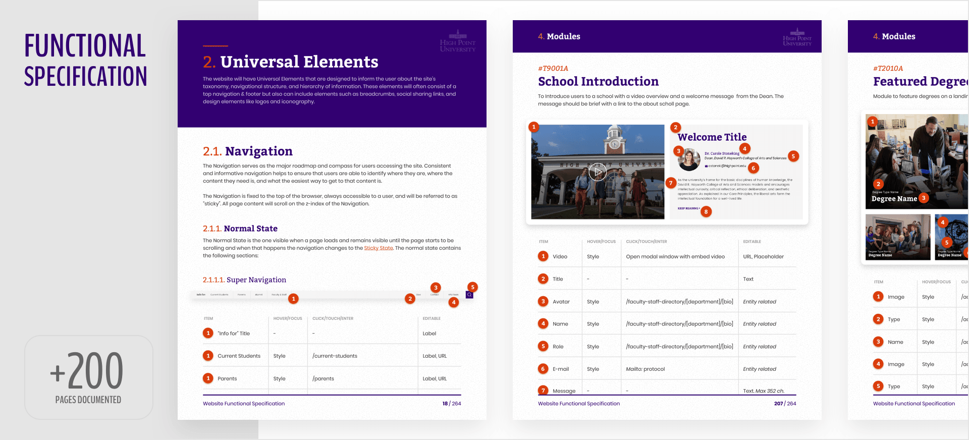
Functional Specification
The objective of this document is to specify all website functionalities, from where a click of a button goes to how the database entities are correlated throughout the entire project. With over 200 pages this document exposes every website's details.
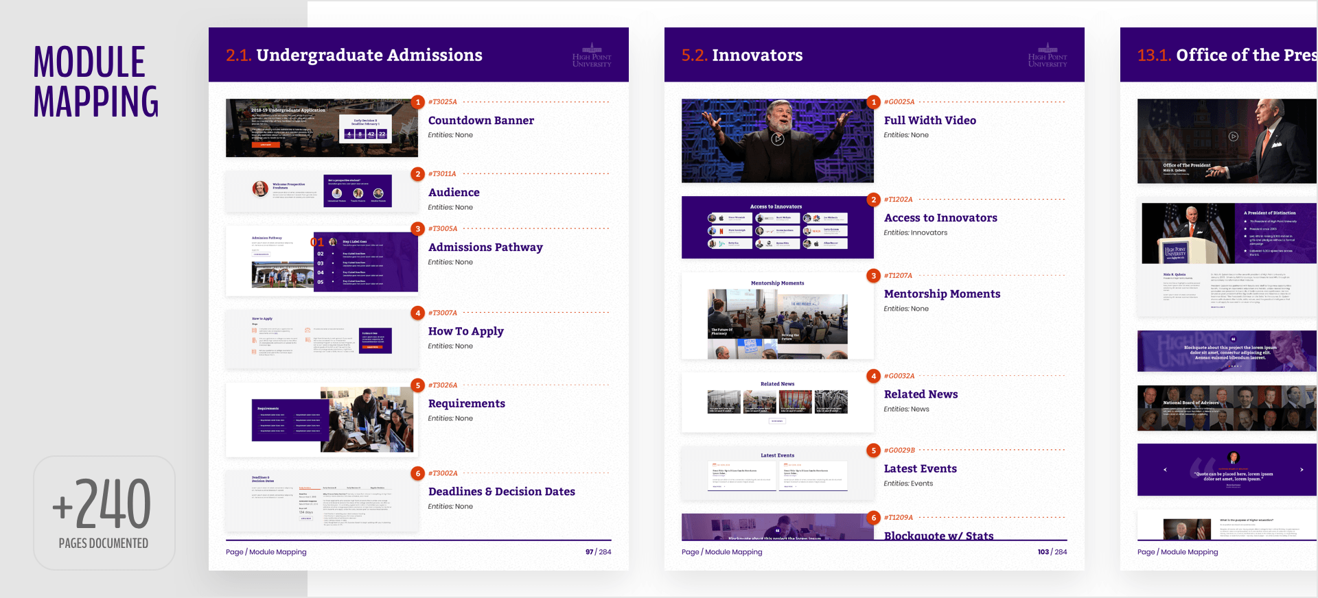
Page/Module Mapping guide
With a modular approach and a demand for constant updating, it's important to have a guide to apply the correct modules/content to the correct pages. This document provides an ideal structure, page by page of how the modules should be laid out.
Because a university's website is always changing and improving, this document was stored on a collaborative platform where the website's maintainers can always update it while the project is evolving.
Platform
HTML/CSS - Wordpress